

Text reading 'OpenVAX'
Six light-colored eggs in a cardboard egg carton.

Strong, clear, and built to last. For Opperman Build, we created a complete brand identity, a modern website, and supporting print materials that reflect the precision and care behind every project.

From bold, confident typography to layouts that balance professionalism with approachability, every element works together to communicate quality and trust. The result is a brand that stands out in the construction space—consistent, memorable, and ready to be experienced across every touchpoint.

Scope:
Brand Design
Website Design + Development
Print Signage Design
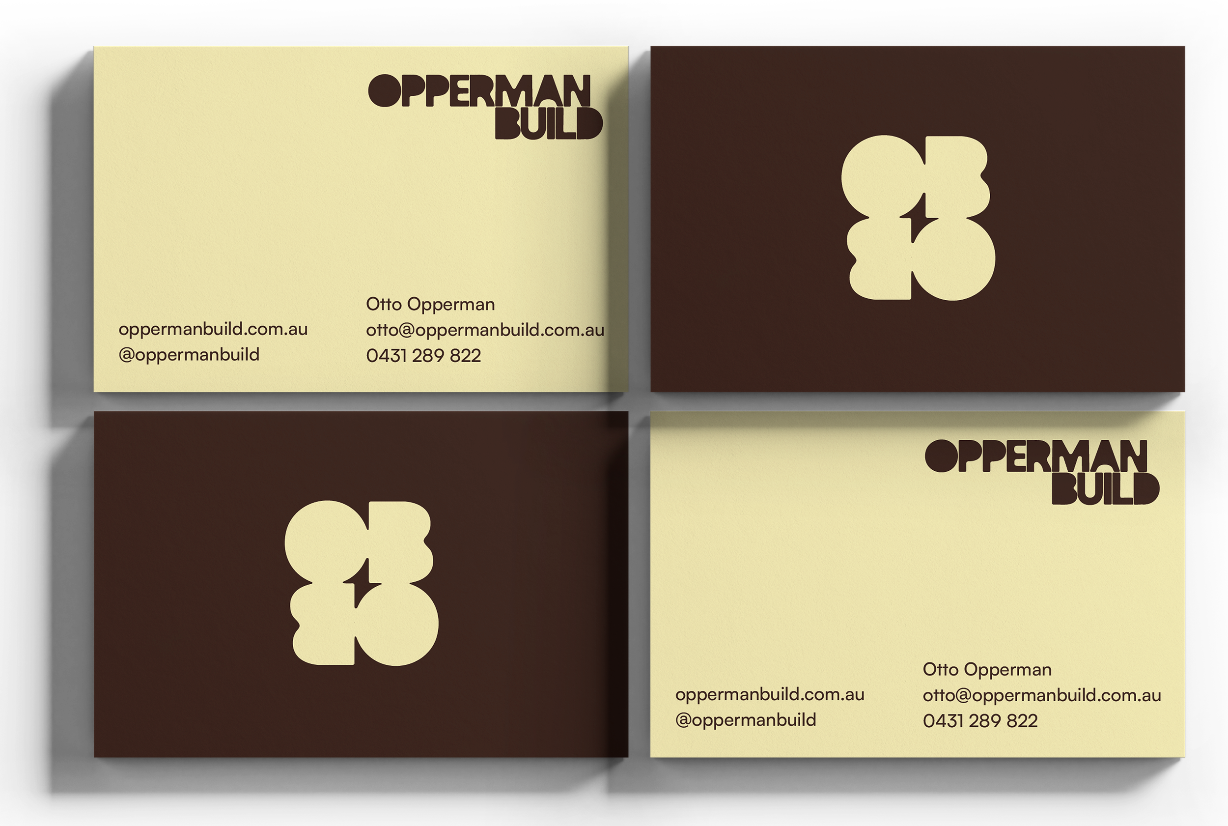
Split business card with a beige background on the left side featuring the text "OPPERMAN BUILD" in bold, and contact information including a website, email, and phone number. The right side has a dark brown background with a large yellow ampersand symbol.
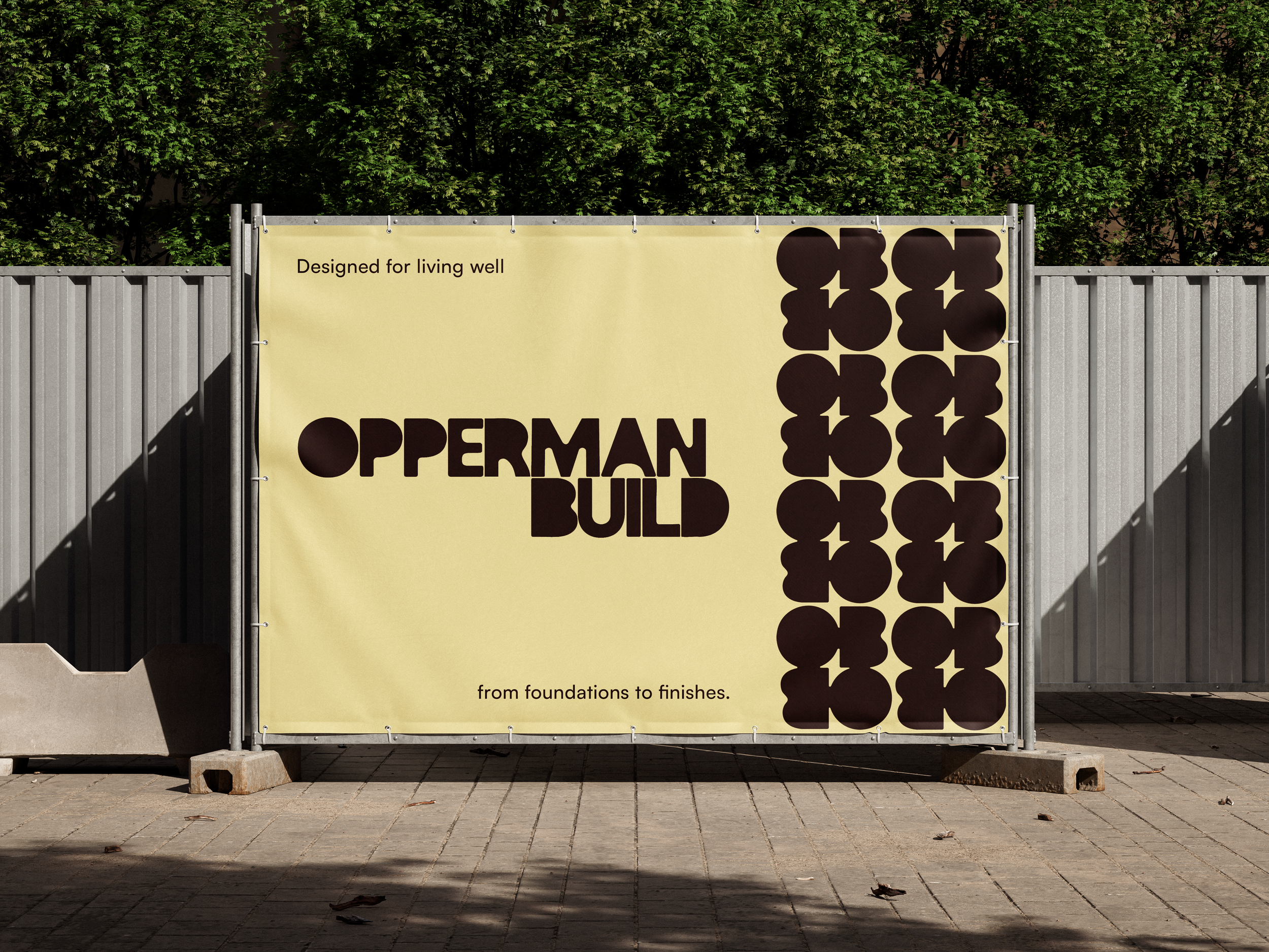
A construction fence with a yellow banner that reads "Designed for living well" and "from foundations to finishes." The fence has a pattern of black quatrefoil shapes on the right side. There are tall green trees behind the fence and a concrete sidewalk in front.
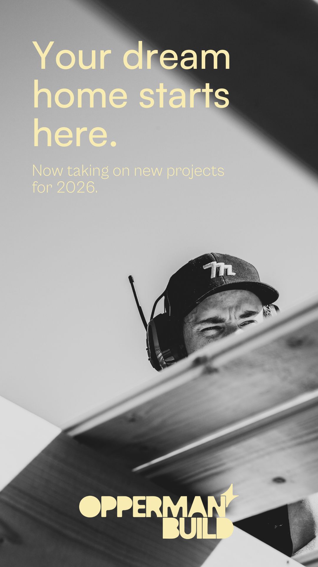
Promotional poster with a black and white photo of a person wearing headphones and a cap, partially hidden behind a piece of wood. The text reads: "Your dream home starts here. Now taking on new projects for 2026." The business name appears as "OPPERMAN BUILD" at the bottom.
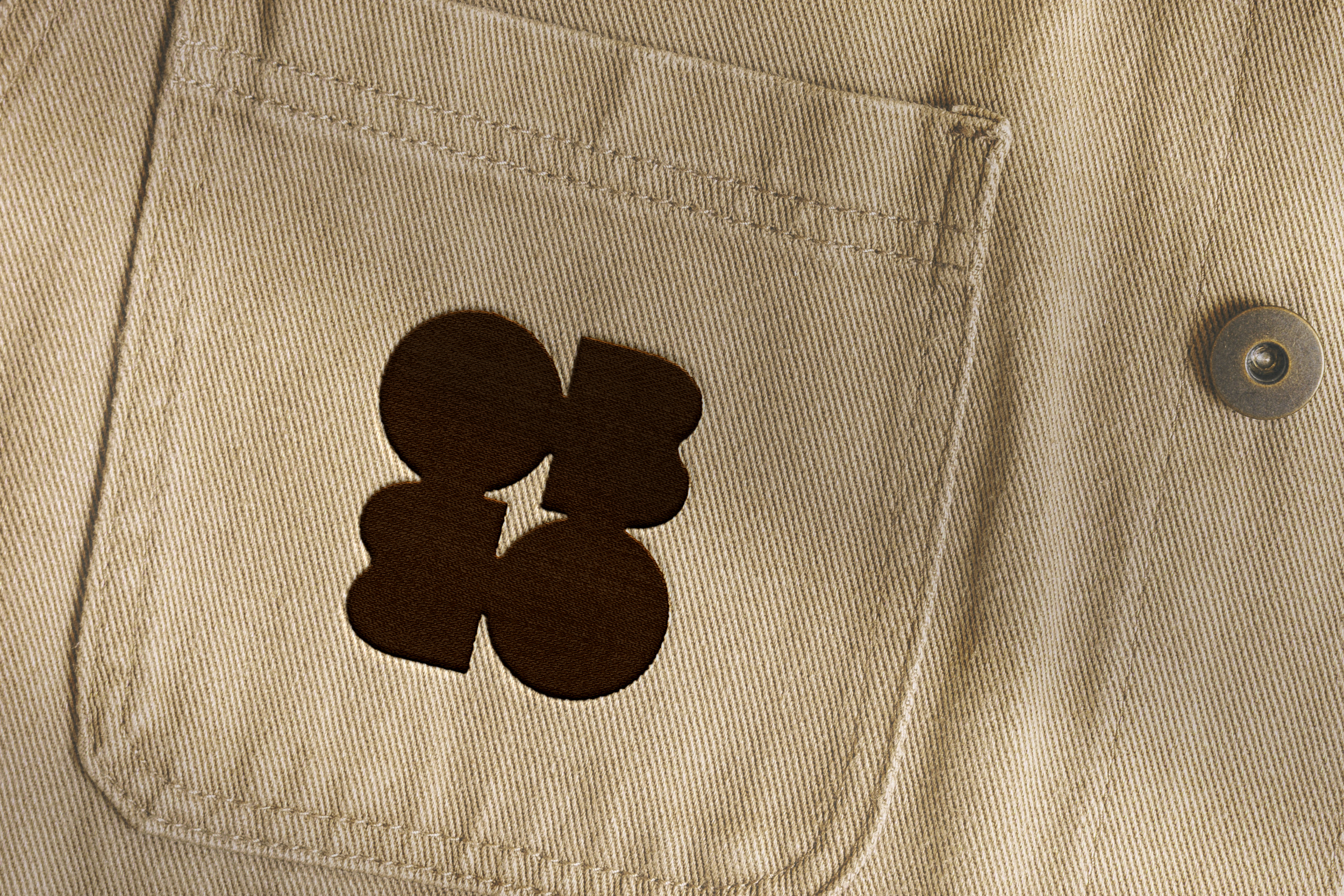
Close-up of khaki-colored fabric with a pocket and a decorative button, featuring a dark brown Mickey Mouse-shaped appliqué.